Monthly Site Refresh
While the promotion banner may change weekly, every month the entire site gets a refresh to keep aligned with our editorial calendar.
The IZOD homepage was built around a familiar shopping experience while allowing each seasonal campaign to feel fresh. We intentionally kept the recognizable navy promotional banner at the top to maintain brand consistency for returning customers, then introduced warmer seasonal colors throughout the hero imagery to welcome the summer collection.
After light photo retouching, the supporting three-up imagery echoed the look and feel of the masthead, creating a cohesive visual flow while highlighting the season's featured promotions.
Further down the page, we shifted the layout to spotlight one of IZOD's strongest categories—golf apparel. By framing the men's and women's collections with generous white space, we created a natural visual pause that helped distinguish this section from the promotional content above and guided shoppers toward a new product category.
Throughout the experience, I partnered closely with the copy team to ensure the messaging reflected IZOD's relaxed, approachable personality. Every visual decision—from color and layout to imagery and typography—was designed to reinforce that same easygoing brand voice.


Design in a pinch
What happens when the brand team falls in love with your watermelon concept... but your company's image license expires?.
You make a trip to the grocery store!
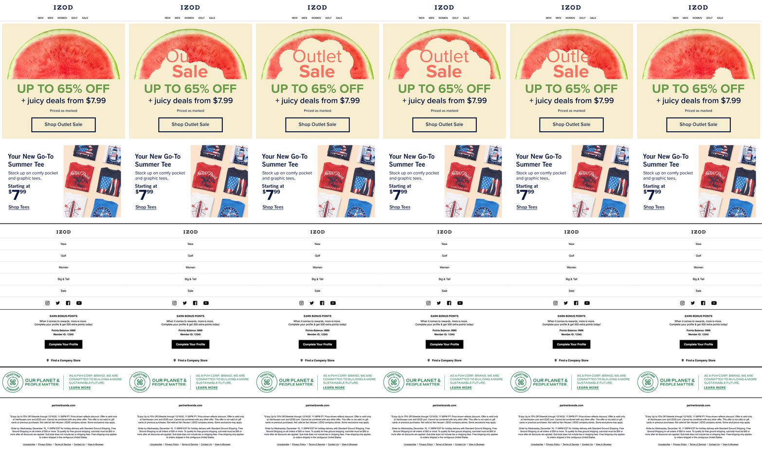
With a quick photoshoot, a little photo retouching, and a lot of creative problem-solving, a supermarket watermelon became the centerpiece of an entire summer campaign. Below is the progression from the original photo to the final assets, showing how a single concept was adapted across multiple marketing touchpoints.
It's also proof that fruit apparently has beauty standards too.

Before and After

Desktop

PLP

Mobile banner

Desktop Banner

Mobile

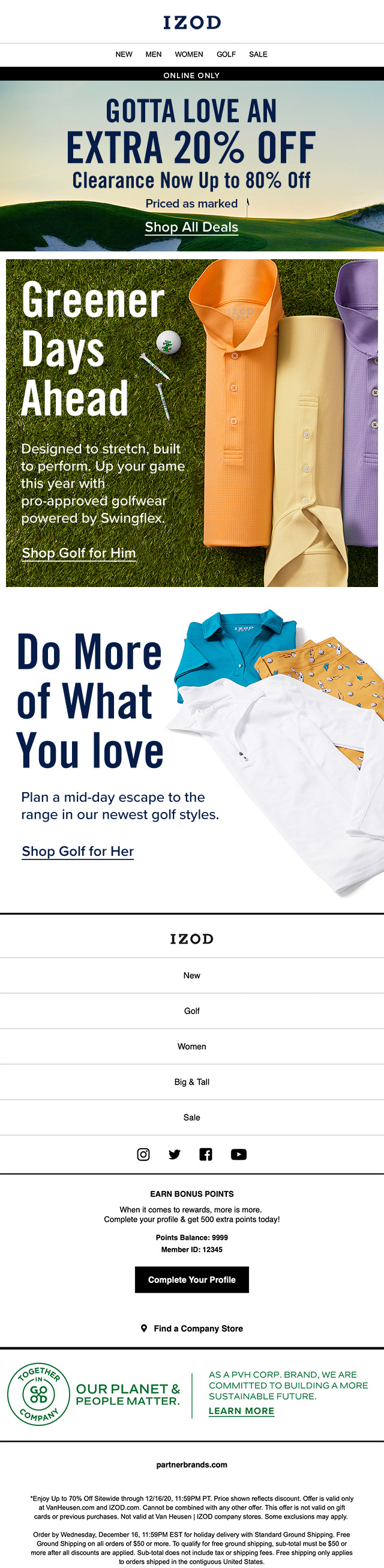
Emails
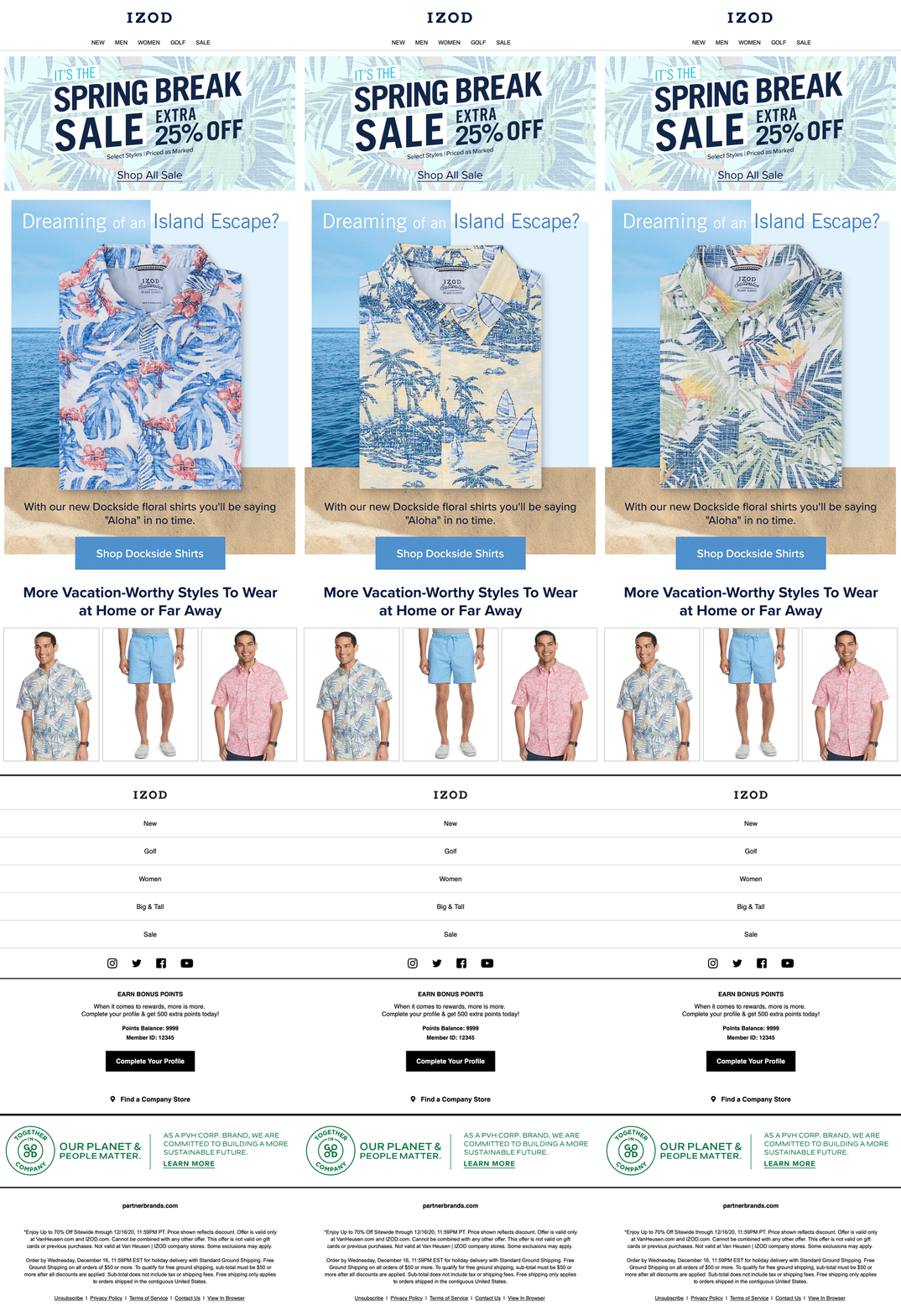
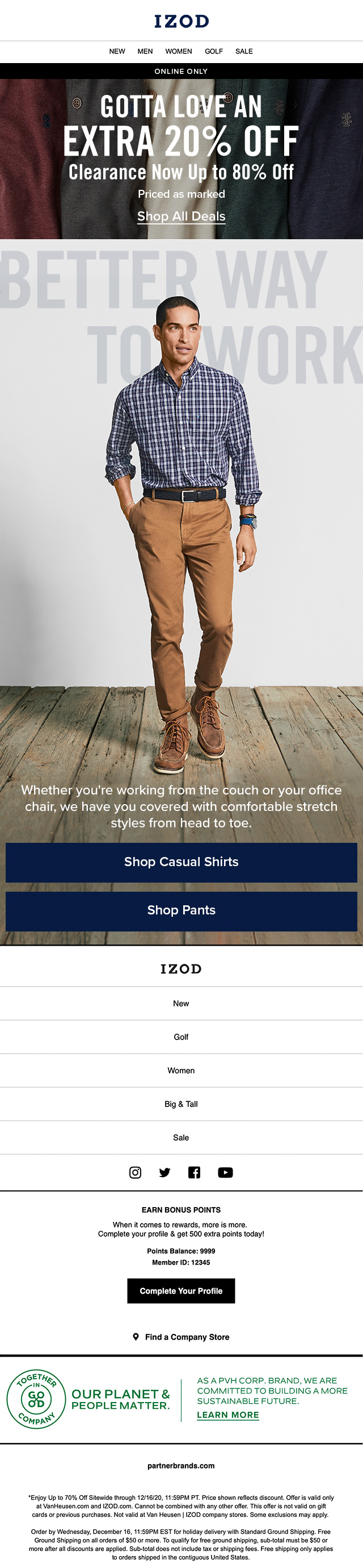
Email may only have a few seconds to capture someone's attention, but it's one of the most direct conversations a brand can have with its audience.
These examples span different points in IZOD's editorial calendar, where the goal wasn't simply to announce another sale—it was to give each campaign its own identity. Working closely with the brand and copy teams, we developed seasonal narratives that kept the content feeling fresh while maintaining a consistent brand voice.



Designing for Wholesale
Creating clean and user friendly product pages for Amazon A+ and Walmart.
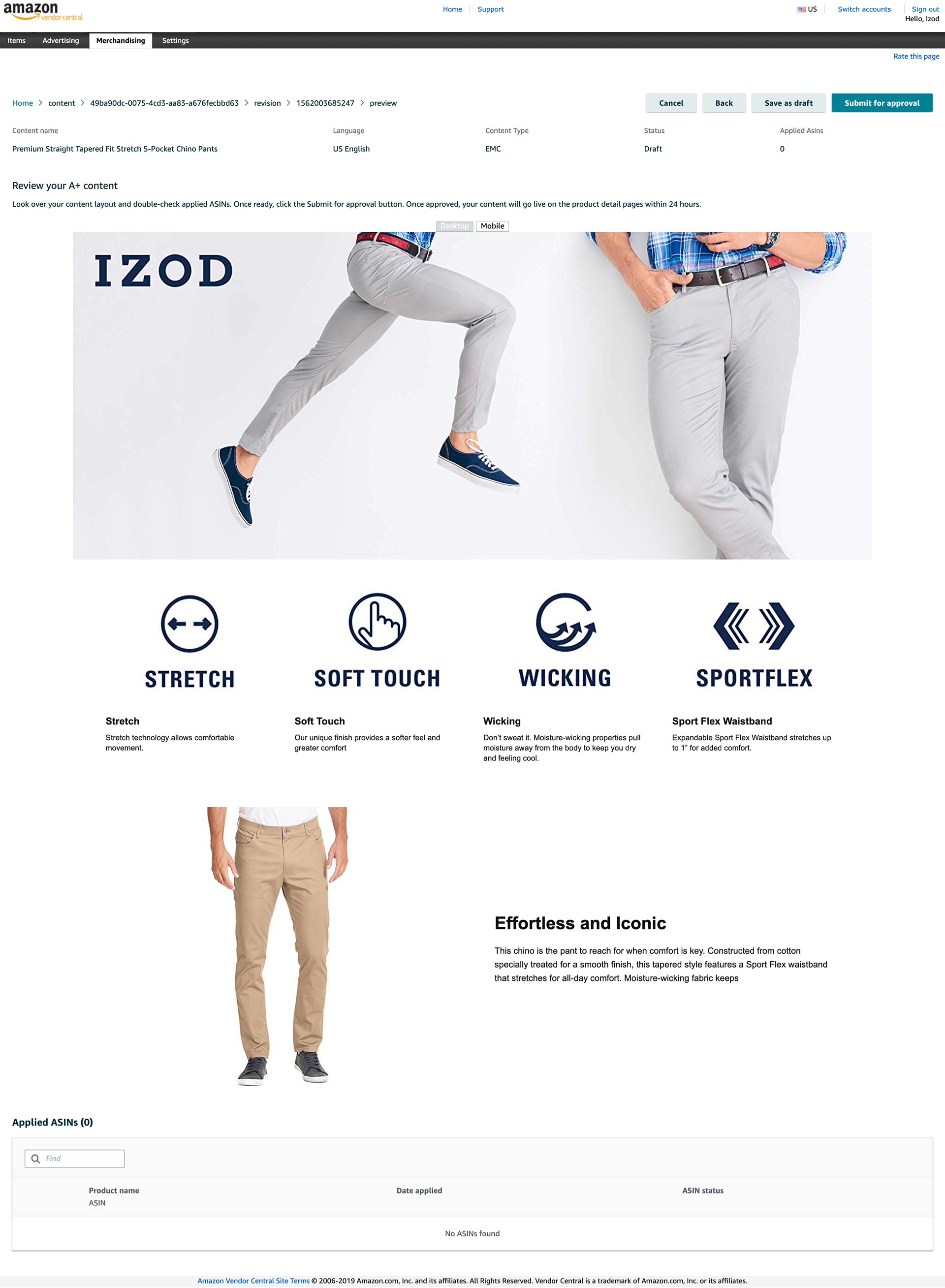
Not every customer begins their shopping journey on IZOD.com. Many discover the brand through retail partners like Amazon and Walmart, making these product pages just as important as the brand's own website.
Designing within established marketplace templates meant finding creative solutions inside strict constraints. Whether it was photographing products on seamless white backgrounds to blend naturally with the platform's interface or combining multiple images into a single banner to showcase craftsmanship while minimizing scroll, every decision was made to improve clarity, build trust, and help customers make confident purchasing decisions.
Working within these limitations reinforced an important lesson: great digital design isn't always about having complete creative freedom—it's about creating the best possible experience with the tools you're given.